Bringing Life to Your Interior
Bringing Life to Your Interior
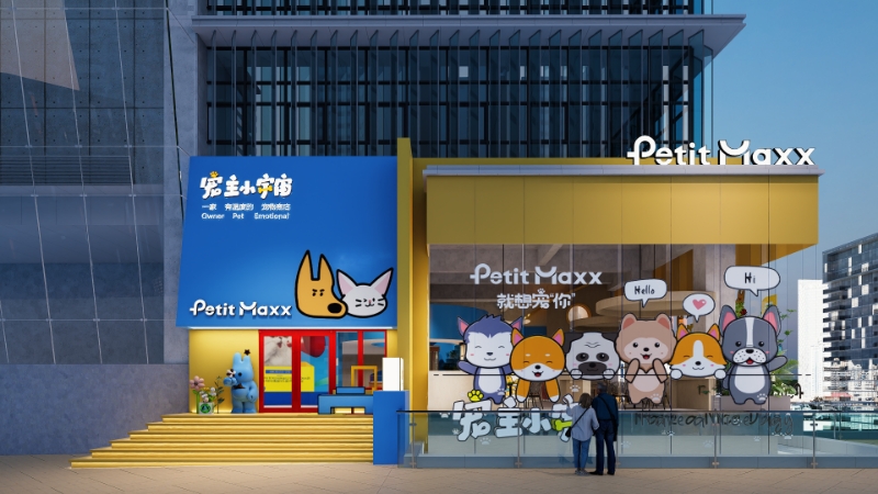
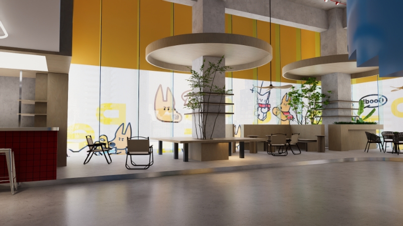
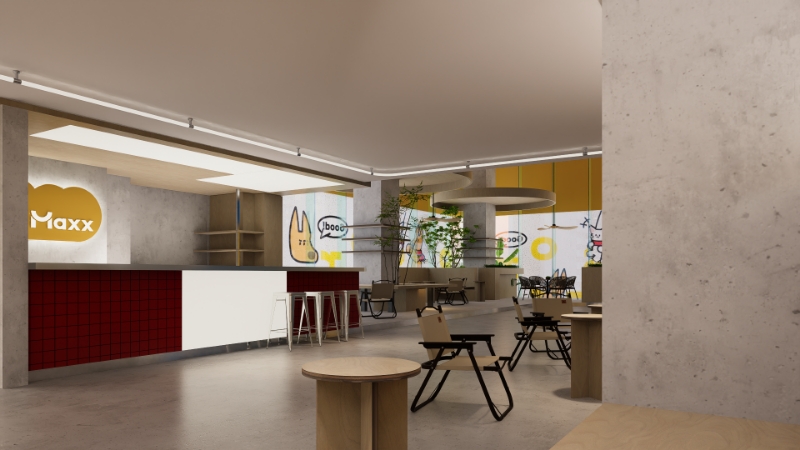
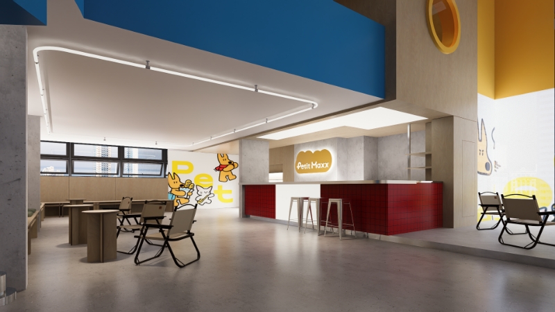
We use color to tell your story the moment guests step inside. Saturated hues are balanced with calm neutrals to create zones—bold color-blocked counters for ordering, softer palettes for lounging, and energetic accents near grab-and-go. Strategic repetition across walls, menus, and packaging builds instant brand recognition while keeping the space cohesive and memorable.
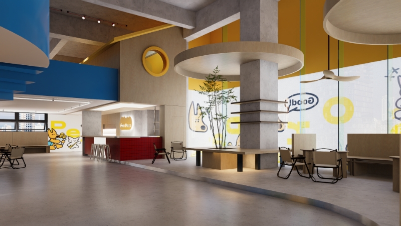
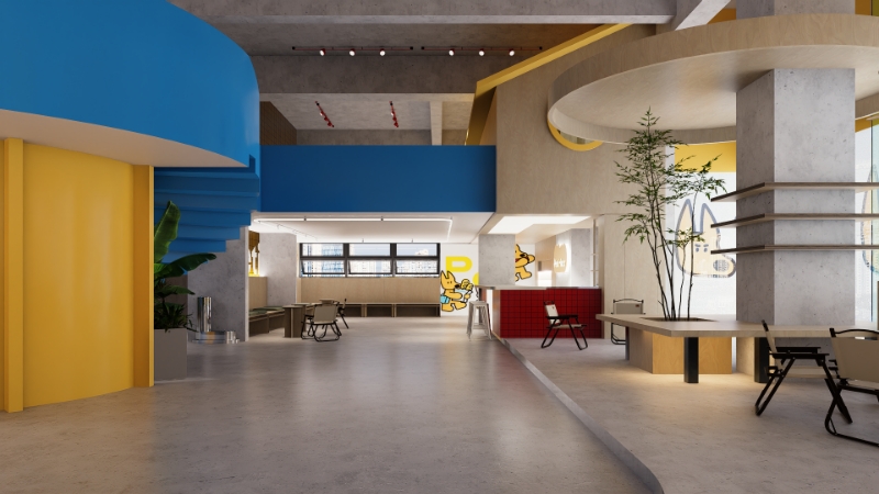
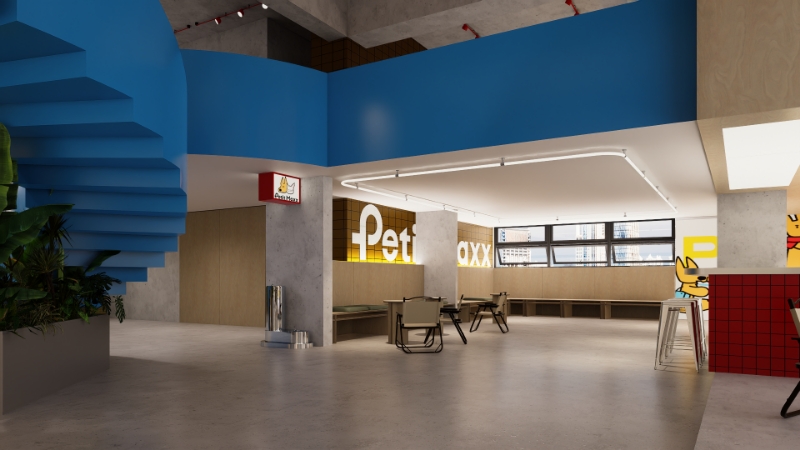
Color comes alive through texture and pattern. Think glazed tile, terrazzo, powder-coated metals, lacquered millwork, and performance fabrics that hold their tone under daily use. We mix stripes, checks, and graphic murals with natural woods and matte finishes to ground the palette. The result is joyful yet refined—vibrant without visual clutter.
Lighting shapes mood and amplifies color. Tunable LEDs warm up mornings and glow at dusk, while neon lines, pendants, and wall washers spotlight feature walls and displays. Artful installations—hand-painted murals, tiled gradients, or sculptural planters—create Instagram-friendly moments that drive organic marketing and make every visit feel special.
A great cafe feels good to linger in and easy to operate. We plan clear circulation, color-coded wayfinding, and flexible seating—mixing banquettes, bar perches, and communal tables. Acoustic panels, wipeable finishes, and stain-resistant textiles keep the vibe lively but not loud. Behind the scenes, smart storage, durable surfaces, and concealed power ensure the space stays vibrant, efficient, and welcoming all day.
No products in the cart.